zingy
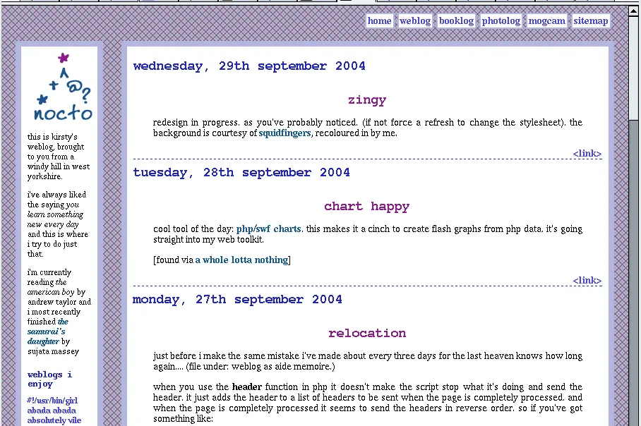
redesign in progress. as you’ve probably noticed. (if not force a refresh to change the stylesheet). the background is courtesy of squidfingers, recoloured in by me.
it’s been through my usual non-rigourous testing process (a) get it to look like i want in mozilla on linux b) check it doesn’t look too awful in ie on windows) so if it looks violently different to this screenshot to you then please let me know (big blank spaces, overlapping text, unreadable etc i’m not bothered about pixel perfection!)
